In March, ispmanager rolled out a brand-new interface (version 6.139, beta) — a carefully designed update built on a unified design system. The full power of a 20-year-old control panel is now available in a clean, high-contrast interface designed for everyday work.
If you already use ispmanager, you’ll still feel at home. The panel structure and main navigation remain the same, and things are right where you expect them to be. But many details have been carefully refined — especially when it comes to usability.
Better readability and accessibility
We paid special attention to clarity and accessibility.
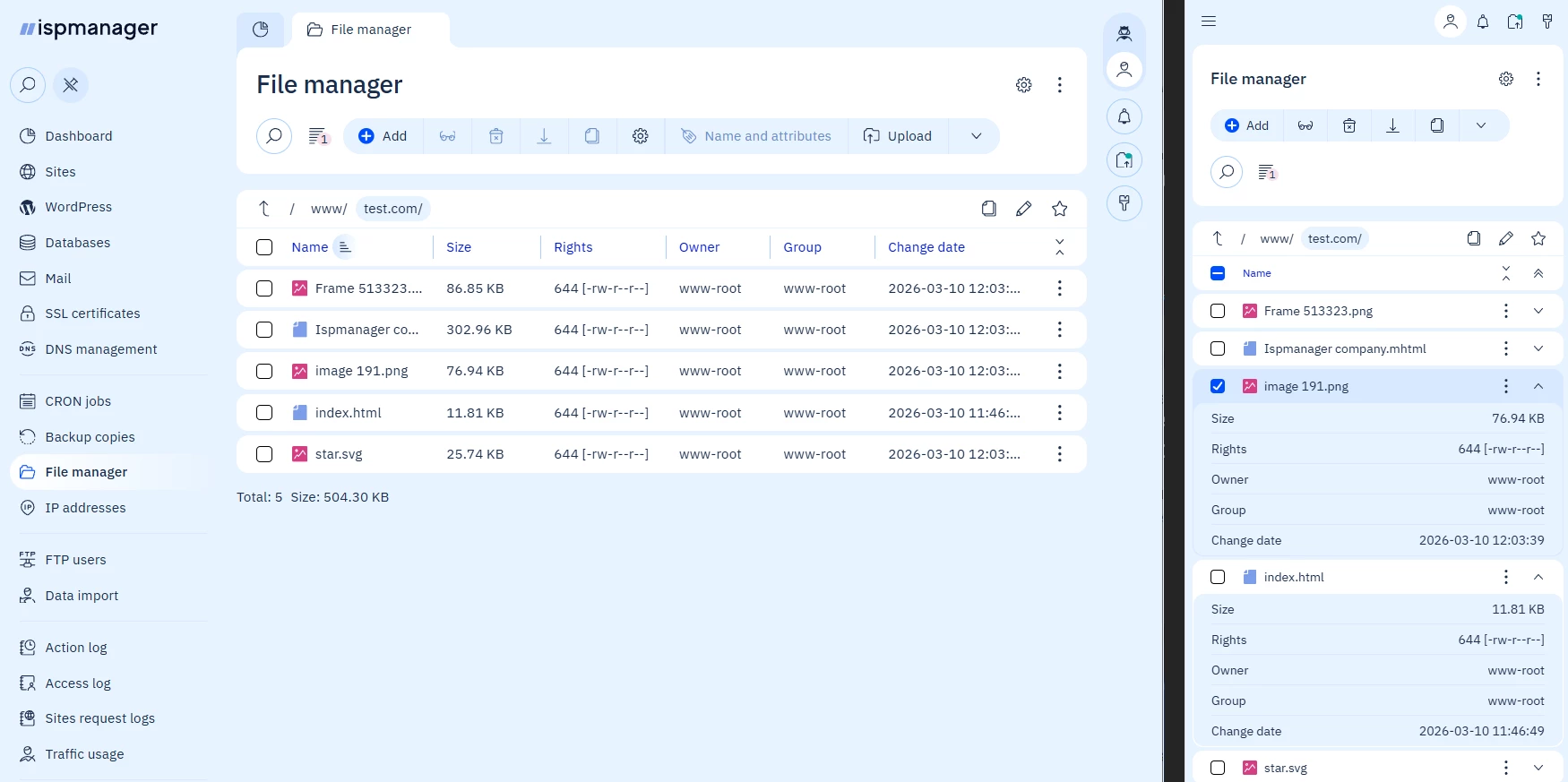
The updated interface features improved contrast and typography, making information easier to scan — particularly in tables and configuration screens. Key elements stand out more clearly, so actions and statuses are easier to spot at a glance.
The panel also adapts better to different screen sizes, making it more comfortable to work on laptops and smaller displays.
Familiar efficiency, improved usability
Many modern interfaces sacrifice information density in favor of large spacing and minimalist layouts. That approach doesn’t work well for infrastructure tools.
In ispmanager, we kept the high information density that experienced administrators rely on while improving visual hierarchy and readability. You still see everything you need on a single screen — it’s just easier to navigate and process.
And that’s not all. We’ve added an information density switch, so you can choose the layout that feels most comfortable for your workflow. Speaking of customization…
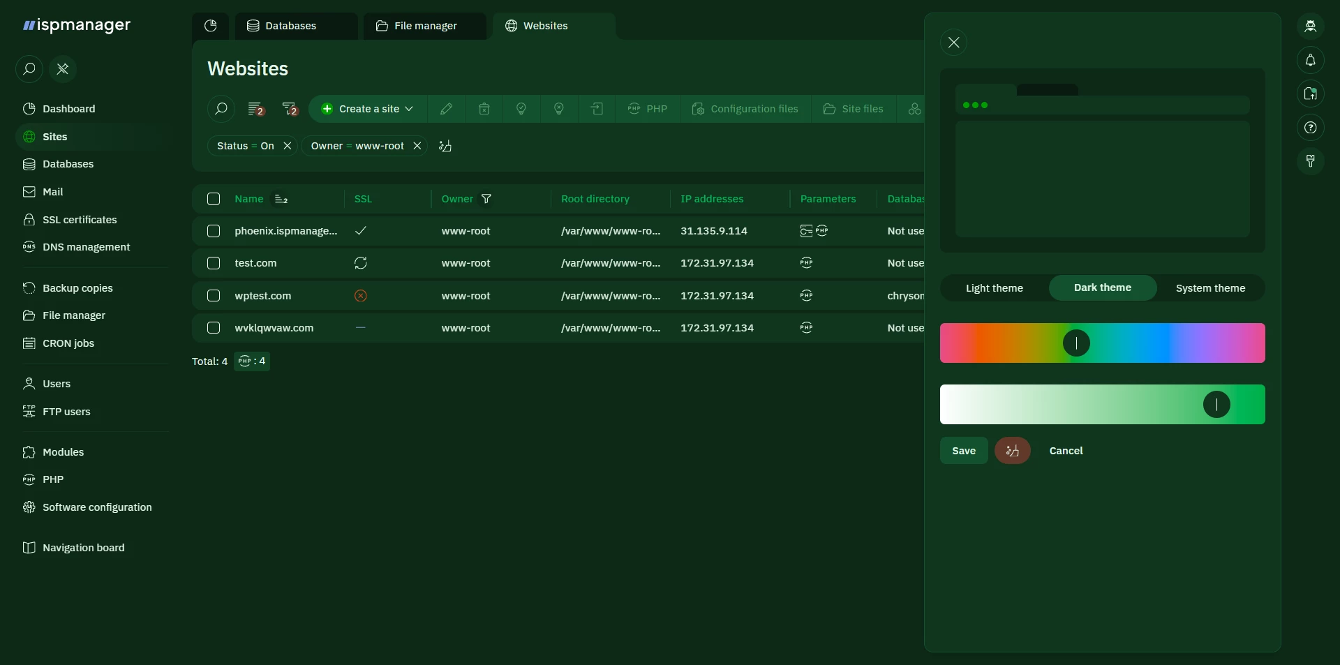
Interface personalization
The updated theme system allows users to customize colors while maintaining accessibility standards.
Using the OKLCH color model, you can adjust the hue and saturation of the interface theme in the settings. The system automatically preserves proper contrast levels, so readability remains strong regardless of how you customize the interface.
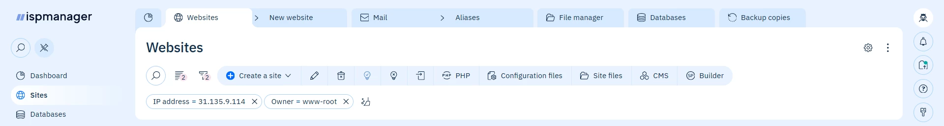
Improved tab management
Managing multiple sections just got easier — no more endless tabs or hunting through clutter.
Tabs are managed without horizontal scrolling. When many tabs are open, they move into a dropdown list, allowing you to quickly switch between them. You can also close multiple tabs at once, helping keep your workspace organized.
Navigation that stays familiar — but works better
The main menu structure hasn’t changed, but it now behaves more consistently across different screens and resolutions. Navigation remains predictable while adapting more smoothly to different layouts.
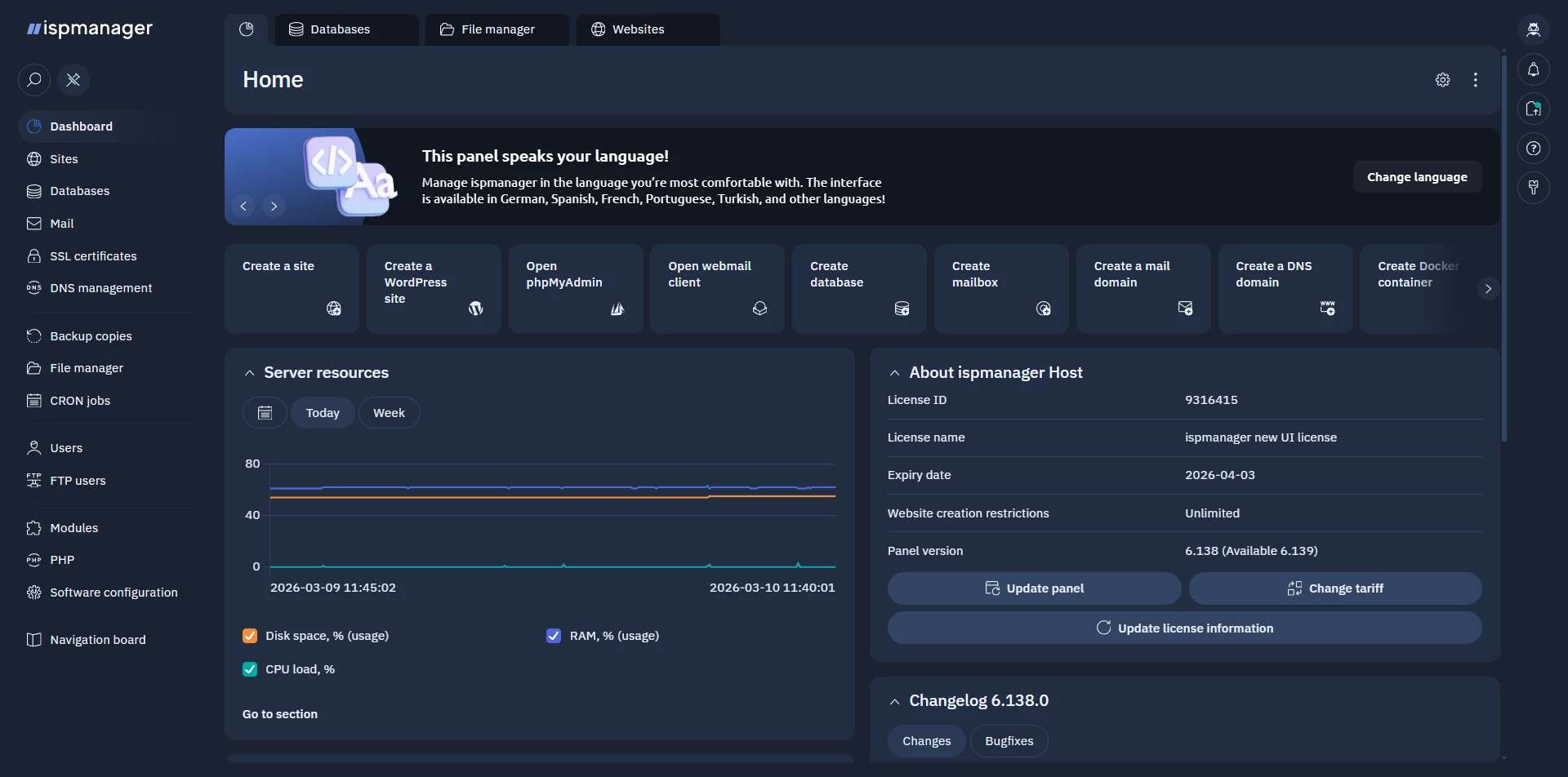
New widgets and dashboards
We’ve also introduced updated widgets and dashboard components that make it easier to monitor key information at a glance and organize the panel around your workflow.
We hope the updated interface will make your everyday work with ispmanager even more enjoyable.
The new version is already available in the panel — switch to it, explore the new interface, and shape a workspace that works best for you.